How Can Propeller’s Web Design Services Enhance Your Online Presence?
Design is vital when creating compelling experiences online. A great UI & UX design agency increases adoption, conversion, loyalty and retention. Our design team has the capabilities to enhance your digital presence and deliver exceptional user experiences with the following skillsets and services:

Our UI & UX Design services
Our team of design professionals consider UI & UX design principles in every project they take on. Take a look through our UI & UX design services and see how we can improve your digital presence with a bold and considered design approach.
How do Web Design Audits Identify Opportunities to Improve Your Site?
We prioritise user research at the beginning of every project to get to the core of what your customers want. Superior UX is integral to the success of any website. With this in mind, we ensure client success by activating user-centric solutions.
What is User-Centric Design and How Does It Improve User Experience?
We apply human-centred design methods to complex systems using service design, creating and improving your products presence online. Understand and align every service aspect, from the customer experience to the behind-the-scenes systems.
Creating Seamless, User-Friendly Website Experiences
Our design team create user-friendly digital environments to optimise information accessibility and usability for websites and applications. This is achieved through designing clear hierarchies, labels, and navigation.
Bringing Your Website Ideas to Life Before Development
Our team will connect your website’s information architecture to its visual design, allowing you to refine and validate your design concepts before committing to their development. We enable all of our clients to test their new website’s functionality and flow before it goes into full development.
Designing Intuitive, Beautiful, and User-Focused Interfaces
Our designers follow UX principles in every project they take on. Through user research and usability testing we can produce competent websites with user behaviour in mind. Our UX designers craft intuitive experiences for digital and physical interfaces, ensuring efficient navigation and increased user satisfaction.
User Interface design involves designing the look and feel of digital products, focusing on elements like buttons, icons, and layouts. We optimise user interaction to ensure a seamless and aesthetically pleasing experience across all platforms.
Making Your Website Accessible to Every User
We create digital solutions that are usable by everyone, regardless of ability or disability. Our designers ensure they create inclusive pages, such as readable text, keyboard navigation and alternative media, ensuring an equitable and user-friendly experience for individuals with diverse needs.
Benefits of using UI/UX design services
Having an expertly crafted UI & UX design gives your business a significant competitive advantage. With millions of websites and mobile apps vying for users’ attention, it is crucial to stand out and provide a superior user experience to attract and retain customers.
Investing in UI & UX design proves that your business values the needs and expectations of its users. It can create a positive impression of your brand, enhance your credibility, and establish your business as a leader in your industry. This builds customer loyalty and trust, as users are more likely to choose a business that prioritises their experience.
Why Choose Propeller for Your Website Design and Development Needs?
Expertise & experience
Propeller boasts a team of experienced UI & UX designers who are passionate about the latest trends, tools and techniques available.
Customised solutions
Every business is unique, and we understand there is no one-size-fits-all solution. We tailor solutions to your specific needs.
Clear timelines
Our project management team ensure that your work stays on track and within budget while upholding a high level of quality.
Hear it from our clients
We hit the jackpot with them. We continue to work with them as their support is so great. They brought a lot more to the table than just development.
Sarah Mespelt Larranaga, VP of Design, Freestream
Propeller have always responded promptly which has been hugely appreciated, thanks to the team for their support and patience.
Christie Valone, Digital Marketing Manager, Celtic Collection

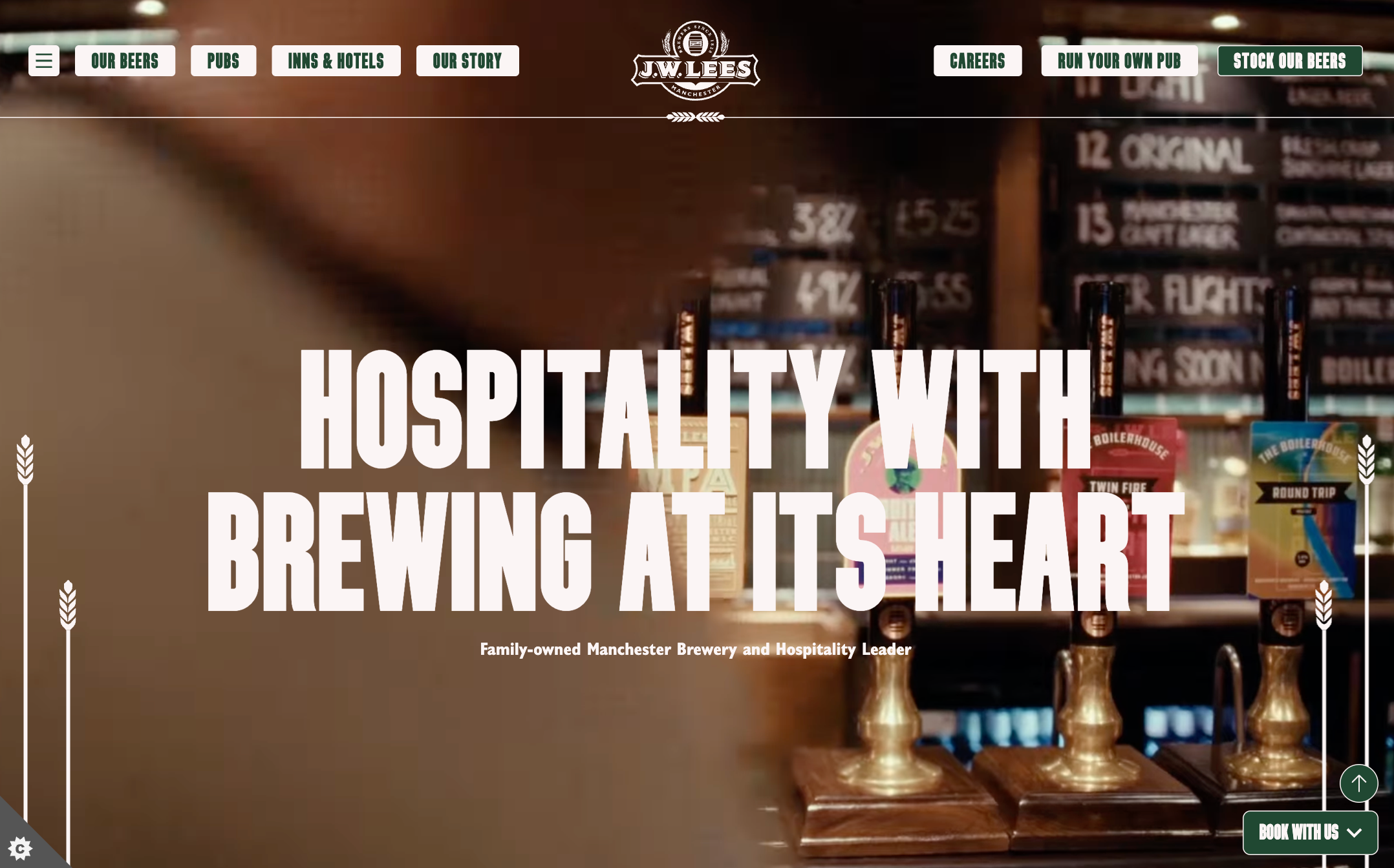
The roll out, execution, and project management were exceptional. Thanks to Propeller, we experienced a 50% increase in traffic and a 150% boost in conversions to bookings.
Sharma Cook, Head of Marketing, JW Lees

The Propeller team has a deep understanding of the business and its goals. They really know our business and our pubs inside out.
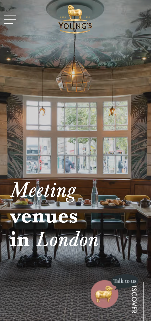
Jenny Alcock, Head of Digital, Young's

Frequently Asked Questions
Read more